A market stall site that shows you the order as you build it
A full rebuild for a London onigiri stall, taking first load from 5.4 MB to 244 KB while adding a live quote builder.
Delivered, client has not switched the domain over
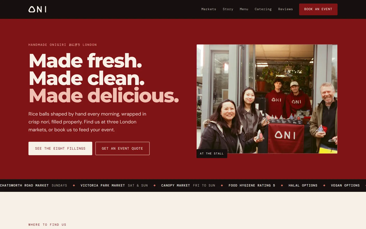
- 244 KB
- First load, against 5.4 MB
- Both measured on 17 September 2026 in a real browser with text gzipped, the rebuild locally and the original at its live address. 11 requests against 13. Read the whole of the old page and it reaches 8.9 MB over 23 requests; the rebuild has already loaded everything at 244 KB.
- 0
- Contrast failures
- 241 text elements measured against their real composited backgrounds, including all eight menu bands lit and both dialogs open.
- 0.0024
- Cumulative layout shift
- Every image carries width and height, and the photo reel reserves its own height before the photographs arrive.
- 10 KB
- JavaScript on the wire
- Gzipped, no framework. 31 KB of commented source behind it.
The problem was not how it looked
ONI sell handmade onigiri at three London markets and cater events. Their site looked fine. It was also 5.4 MB before a visitor scrolled anywhere and 8.9 MB by the bottom of the page, 8.7 MB of which is PNG and JPEG photographs of food saved straight out of a phone. And the single most useful fact on the whole page, where the stall will be this weekend, was the last thing on it.
The catering enquiry had the same shape of problem. You picked quantities at the top of the page and only found out what it would cost after scrolling to the form. Anyone deciding whether they could afford to feed forty people had to guess, and guessing usually means leaving.

The menu became the structure
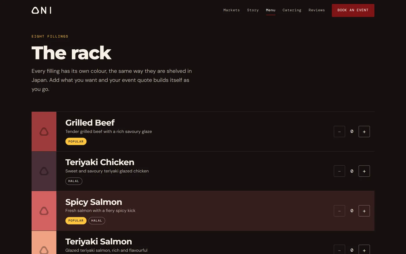
Japanese convenience stores identify onigiri by a colour band per filling. ONI already assigned a colour to every flavour, and their logo is an onigiri seen face on. So the colour stopped being card decoration and became the layout: eight full width bands, and adding a filling to your order lights its band up. Your order is visible as colour on the shelf.
A rail pinned to the bottom of the window carries the running count, the rate tier you have reached, and the total. The pricing ladder highlights your current tier and tells you how many more would drop you into the next one. The basket survives a refresh.
Four of their own menu colours failed contrast
The old site set cream text on all eight flavour cards. Measured, four of them failed: teriyaki salmon at 1.82, kimchi tofu at 1.72, spicy tuna mayo at 2.76 and miso mushroom at 2.99, against a requirement of 4.5. Each band now uses whichever of cream or near black passes against that specific colour, so the brand palette survives intact and the text is readable.
The booking form used placeholders instead of labels. The quantity steppers had no visible focus state and no accessible name. Both are fixed, and the basket total is announced when it changes.
The photographs got somewhere to go
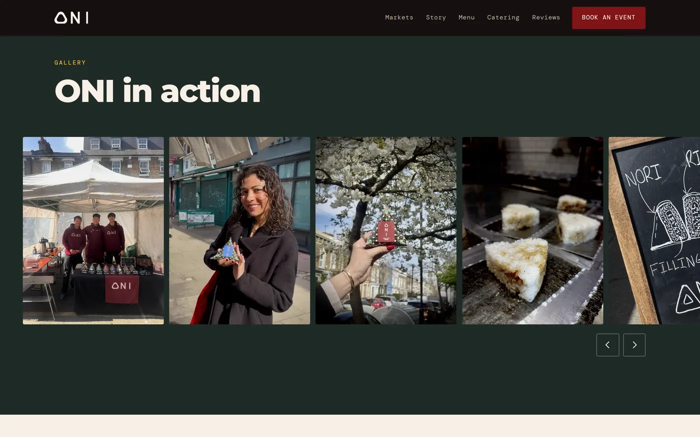
The gallery was a grid that grew on hover. It is now a single full bleed strip drifting left at about 21 pixels per second, measured across five viewport widths, slow enough to read and fast enough to notice. You can drag it, use the arrows, or tab through it. It stops completely under reduced motion.
Two things in that code look wrong and are deliberate. Scroll position is held as a float in JavaScript and written to the element each frame, because incrementing scrollLeft directly reads back rounded and loses a sub pixel every frame until the strip stops moving. And the wrap distance is measured from the first photograph to its copy rather than taken as half the scroll width, because half the scroll width also counts the track padding and the loop would jump by a gutter on every pass.
Checked in a browser, not inferred from the code
Horizontal overflow was tested at thirteen widths from 320 to 1920 pixels and found at none of them. The hero headline holds three single lines at all thirteen. The photo reel loops without a visible join at 360, 768, 1280, 1920 and 2560. The reviews are real, moderated, and fetched live from ONI’s own database rather than typed into the page.
One third party request leaves the origin, to Supabase for those reviews. Nothing else. The fonts are self hosted and had their unused axes clipped, taking Montserrat from 38 KB to 27 KB and DM Sans from 62 KB to 36 KB.
What this involved
Built with